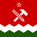
Fujai Posted December 9, 2018 Share Posted December 9, 2018 (edited) Hey there folks. I've put together some ideas for unified regional branding here, as I think we could use a shake up in our look. There've been attempts before at making a theme for official dispatches, but none have ever stuck past a delegate change. For the time being, I have an emblem, wordmark, dispatch theme, WFE, and a potential new flag. Why have consistent regional branding, you ask? A cohesive look not only makes the region easier to navigate, but it asserts and enhances regional identity. As far as I know, only TWP and Lazarus have no dispatch theme (although they do have some pretty jazzin' graphics kicking around). Without it, we have a harder time displaying who we are both to ourselves and to the rest of the NSverse. My goal for the redesign was to keep everything in line with TWP's identity. Central to that is a sense of playfulness and not taking ourselves too seriously, which is why I tried to went for simplicity, recognizably, and vibrancy. As Dark once said, I believe, TWP runs a tight ship, but we do it wearing a tutu and a propeller hat. The colors I'm using I have [tentatively] titled The West Pacific Scarlet (#CC0000) and The West Pacific Violet (#481C5E), with white as a third color, when needed. Spoiler For the emblem, I wanted to do something that was simple and round, so It could be used in a wide variety of places. Another thought I had was taking the favicon (the blue one here) and using that for the emblem after swapping the colors. The main reason I didn't go with that is because it didn't incorporate the flag and would've been less recognizable, but the option is still there. Spoiler For the wordmark, I really wanted to keep it simple so that it could be typed out and still have the same look. To that effect I used Verdana for the font, because it's widely available both on and off line, with just a simple bold, italic, and color. Spoiler Next are a couple options for a dispatch theme. I took my last attempt and incorporated some of the feedback from Dark's idea thread. The three versions each have a different header. The first is has only the words "The West Pacific", the second has the wordmark, and the third has only the words, with the symbol floated to either side. Edit: I added an example for an FA exclusive template, as an example of something that could be tailored to our ministries. Dispatch just words Dispatch wordmark Dispatch floated symbol FA Update example Should we decide to use these, I think the opportunity should be taken to migrate our official dispatches onto a regional nation. They're very scattered and in some cases duplicated right now. I'm willing to do the legwork for the migration once finals are over in a week and a half (I'll also finish the rest of my backlog then). After that, I can keep it updated when updates and new dispatches are needed. It should be noted that this would apply only to official dispatches, such as the RMB rules, code of conduct, ministry posts, etc, but not to personal projects like Yy's Survival Guide. For the WFE, I kept 90% of what it has now, changed a couple things around, and swapped colors. I didn't link Halo or the Guardians because I didn't want to bother them with a useless ping. I did test it to make sure that it fits inside the length limit, so there's no concern there. The only thing I really took out was the "No RMB recruiting" section, because no region really allows it anyway, so there's not much use in keeping it around. TWP WFE sample Lastly, and probably most contentiously, is the flag. I am in no way opposed to just keeping our original flag (this being the oldest version I know of), although the current version isn't vertically symmetrical (although the old version is technically a bit off as well, I found). Overall, I'm not ecstatic about the flag I did with the new colors, something about it, perhaps the colors themselves, just looks off to me; I'd like to see what you folks think about it. I have a bunch of other redesigns sitting around here if those look better to anyone. Edit: I added a second flag that I'm happier with. It captures more of the depth on our current flag while keeping the new color scheme intact. Spoiler Note: I posted smaller versions of everything so it wouldn't be overwhelming and take three years to load. Later I can post the full size ones and put the svgs up on google drive or something so they're publicly available. Edited December 13, 2018 by Fujai Added a bit on why branding is important, added a flag, fixed link to workmark dispatch Saint Mark, Denieria and Crazy Slots 1 2 Link to comment Share on other sites More sharing options...
Crazy Slots Posted December 9, 2018 Share Posted December 9, 2018 As a graphics / consistency enthusiast myself, I think this is awesome. It’s something real world organizations and businesses often do. The PRL (well, I) had such a thing too. EDIT: So did the Conglomerate, I believe. #BF0000 and #0000BF were the preferred hex codes of several early Fishmongers. Link to comment Share on other sites More sharing options...
Denieria Posted December 9, 2018 Share Posted December 9, 2018 I'm very much in favor of your designs, Fujai. It brings the classic design a more modern update, and the flag looks quite livelier now, fitting the general mood of the region. The emblem looks quite well done, and may even be able to be used as an official stamp for government documents. Link to comment Share on other sites More sharing options...
Big Bad Badger Posted December 9, 2018 Share Posted December 9, 2018 Nice work Fujai! I think that this could really be a wise decision for the region. Link to comment Share on other sites More sharing options...
Saint Mark Posted December 9, 2018 Share Posted December 9, 2018 These are great, Fujai! Link to comment Share on other sites More sharing options...
Westwind Posted December 9, 2018 Share Posted December 9, 2018 12 hours ago, Fujai said: The West Pacific Scarlet (#CC0000) But...but.....Crimson! Mediobogdum 1 Link to comment Share on other sites More sharing options...
Mediobogdum Posted December 9, 2018 Share Posted December 9, 2018 1 hour ago, Westwind said: But...but.....Crimson! A nice historical touch, Westwind! I love it. Westwind 1 Link to comment Share on other sites More sharing options...
Westwind Posted December 10, 2018 Share Posted December 10, 2018 A Cascade of Crimson, On a field of Sable, Highlighted in Argent, Trimmed in Gold. - The Crimson King, The Crimson Order, House of Westwind Delegate of The North and West Pacifics Saint Mark 1 Link to comment Share on other sites More sharing options...
Fujai Posted December 10, 2018 Author Share Posted December 10, 2018 On 12/9/2018 at 1:08 PM, Westwind said: But...but.....Crimson! Oh man, I forgot about the Crimson Order there, definitely a missed opportunity—that could be rectified... I'm glad that there's public support for rebranding! The region could certainly use it after so long. Westwind 1 Link to comment Share on other sites More sharing options...
Elegarth Posted December 11, 2018 Share Posted December 11, 2018 I like it a lot Fujai. And it seems to me you used some of the concepts of what I used to have during my delegacy? Or was that accidental? If this is formally adopted by TWP, let me know so I can edit the current Dispatch with the list of Delegates to show proper branding. Link to comment Share on other sites More sharing options...
Westwind Posted December 12, 2018 Share Posted December 12, 2018 I designed a TWP ambassador credentials page a few years back. twp_ambassador_credentials - bbb.pdf Link to comment Share on other sites More sharing options...
Fujai Posted December 13, 2018 Author Share Posted December 13, 2018 On 12/11/2018 at 10:17 AM, Elegarth said: I like it a lot Fujai. And it seems to me you used some of the concepts of what I used to have during my delegacy? Or was that accidental? If this is formally adopted by TWP, let me know so I can edit the current Dispatch with the list of Delegates to show proper branding. I really liked the simplicity and TWPness of your design, so I had it in the back of my head as I was working on it. I tend to go overboard with detail so that helped tone it down a little. 2 hours ago, Westwind said: I designed a TWP ambassador credentials page a few years back. twp_ambassador_credentials - bbb.pdf Oh I remember those! Were you the one who made that FA logo? It looks really nice. Elegarth and Big Bad Badger 2 Link to comment Share on other sites More sharing options...

Recommended Posts
Create an account or sign in to comment
You need to be a member in order to leave a comment
Create an account
Sign up for a new account in our community. It's easy!
Register a new accountSign in
Already have an account? Sign in here.
Sign In Now